9 Café Website Design Ideas From Real, Live Café Sites
Most café websites follow the same pattern: a big photo of a latte, a menu PDF and an Instagram feed. They're fine, and forgettable. The café down the road has the same layout with a different latte.
Below are nine ideas that break the pattern. Each comes from a live website we built for a real café, so you can open it on your phone and try it. Each one also comes with a smaller version you can use on any website, whatever your budget, whether you run a coffee shop in Melbourne, a bakery in Manchester or a brunch spot in Bengaluru.
The common thread: every idea starts from what customers already love about the café, found in its Google reviews and photos, rather than from a template.
Make the signature dish the opening scene
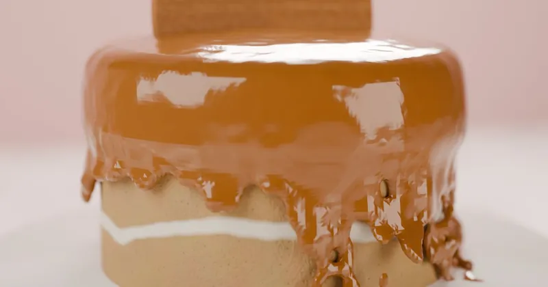
Amintiri's best-known dessert is its Lotus Biscoff pull-up cake, the one where the collar lifts and sauce floods down the sides at the table. So the website opens on that moment: scroll, the collar lifts, and the sauce pours over the cake.
Small version: open with a short, silent video or photo series of your most-photographed dish, not the storefront or a generic coffee cup.
Let the booking form set the table
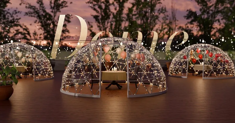
The Dome Cafe rents private glass domes on its rooftop for birthdays, anniversaries, proposals, date nights and friends' nights. Its booking planner slides over the inside of a dome, and the dome redecorates itself for whichever occasion you choose. When you're done, it opens WhatsApp with your plan already written.
Small version: if you host celebrations, ask "what's the occasion?" first, show a photo of that set-up, and send the enquiry straight to WhatsApp with the details filled in.
Show the place at every hour
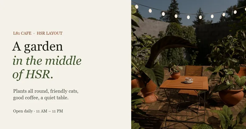
L81 is a garden café that feels different at lunch and at night. Its site has a short film of the garden from 11 AM to 11 PM, with the bulbs coming on beside a running clock. Visitors see both versions and pick the one they want. Casa Fresco does something similar across the whole page: the sky behind every section moves from golden hour to night as you scroll.
Small version: show your space in daylight and after dark, side by side, and label them with the hours.
Turn what you're about into the interface
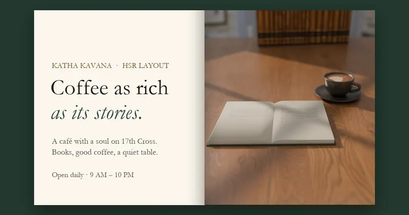
Katha Kavana is a café full of books. Its homepage is an open book beside a cappuccino on an oak table. Scroll and the pages turn, landing on the café's own bookplate, while steam rises from the cup.
Small version: borrow one object from your café, such as a chalkboard, a recipe card or a receipt, and design the menu or headings to look like it.
Let reviews pick the menu highlights
On Amintiri's site, the brunch menu is annotated with what reviewers actually ordered. Casa Fresco's menu is a grid built from the dishes people mention in reviews. It answers the question every new customer has ("what's good here?") using other customers' words.
Small version: read your last 50 reviews, note the dishes named most often, and mark them on your menu as "guest favourites".
Present reviews as something physical
Amintiri shows its reviews as a fanned stack of letters; Casa Fresco shows them as postcards. Both feel more personal than a row of star ratings, and both credit the reviewer by name.
Small version: pick three reviews that mention specific things, show them in large type with the reviewer's name, and link to all your reviews on Google.
Add a creature that belongs there
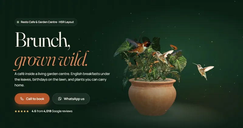
Nivys is a café inside a garden centre, so hummingbirds fly across its pages. Marseli, a European-style patisserie, has real butterfly species that land on its cakes and then follow your cursor around the site. It's playful, and it fits: neither feels like a random animation.
Small version: if your café has a mascot, resident cat or garden, give it a small, tasteful presence, such as an illustration in the footer or a photo in the "about" section.
Serve the meal, one dish at a time
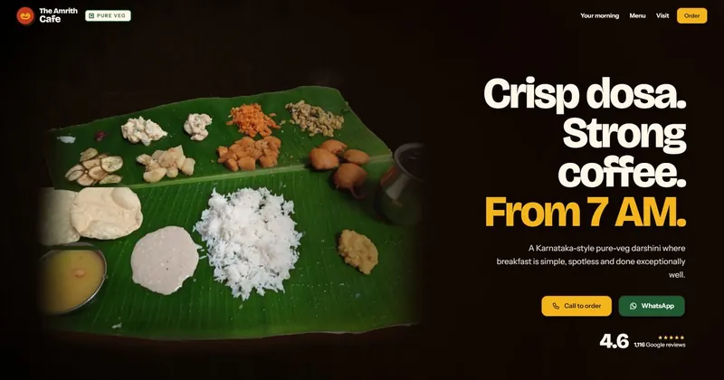
The Amrith Cafe serves South Indian vegetarian meals on banana leaves. On its site, the dishes are served onto the leaf in order, hovering over one names it, and scrolling opens a labelled view of every dish. A first-time visitor learns exactly what they'll get.
Small version: for a thali, platter, tasting menu or set breakfast, show one labelled photo that names every item on the plate.
Let the light do the work
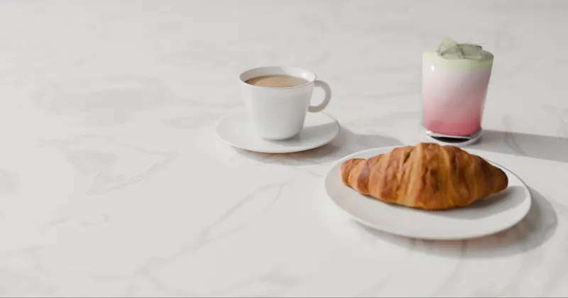
The Faith Cafe is airy and all white, and it doesn't need anything loud. Its hero is a marble table with leaf shadows drifting across it, and the view shifts gently as you move. Calm cafés deserve calm websites.
Small version: match the website's mood to the room. A quiet café should have lots of white space, one strong photo and soft colours, not flashing banners.
Don't forget the basics
Every one of these sites still has the essentials, easy to reach from any screen: the menu as readable text, opening hours, directions, Google reviews, and buttons to call or WhatsApp. A creative idea brings people in, and the basics turn them into customers. Our restaurant and café website checklist covers all of them.
Want an idea like these for your café?
We read your reviews, find your signature moment and build a one-off website around it, for free.
Request a free website →Frequently Asked Questions
Related: Website showcase · 3D websites for small businesses · Restaurant & café website checklist